
Radio10 Rebranding.
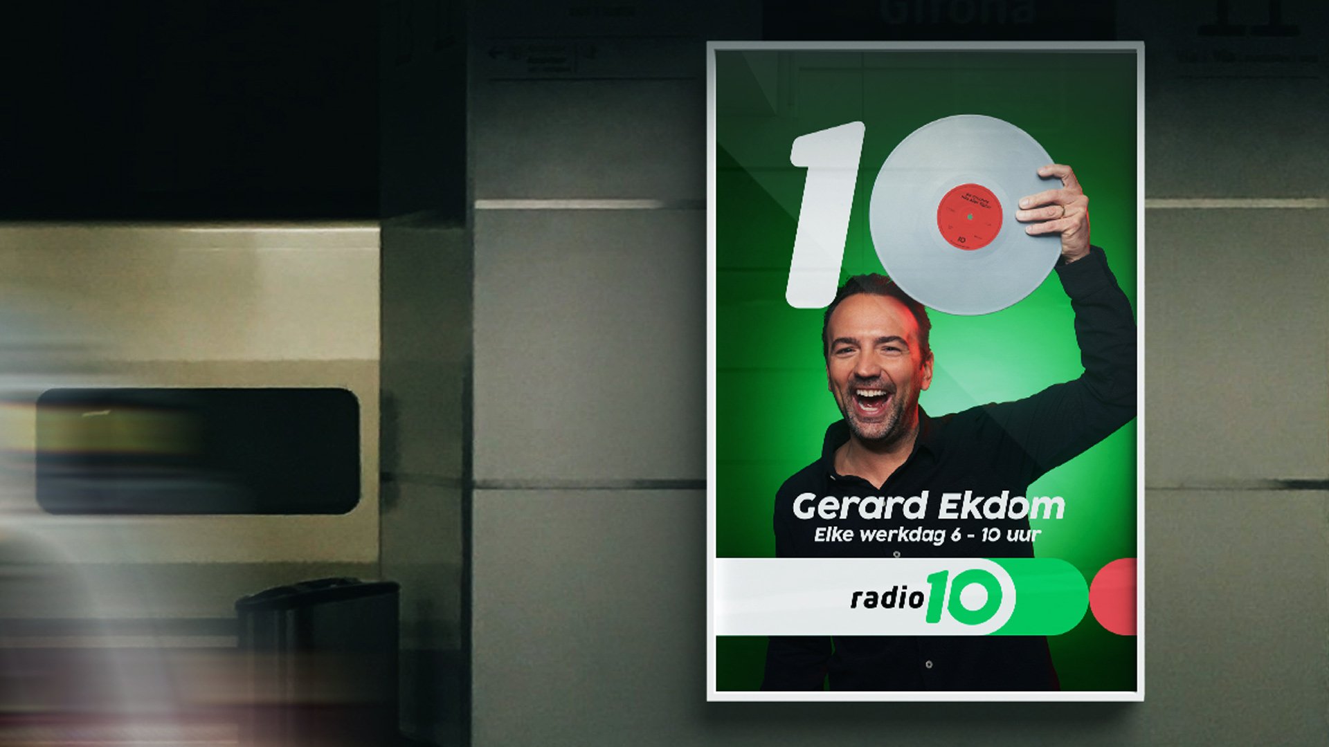
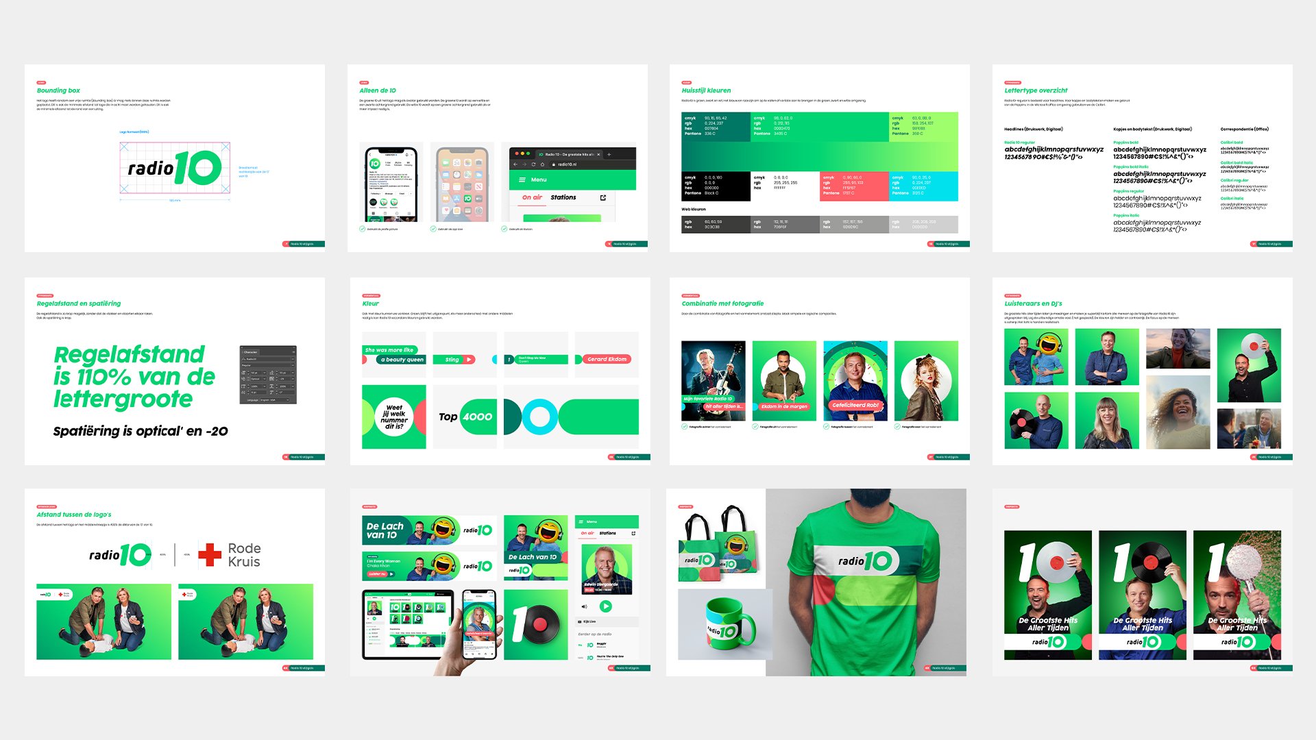
We partnered with Radio 10 to refresh their identity. We created an playful visual identity where the (0) from the 10 the most important element is of the visual identity.
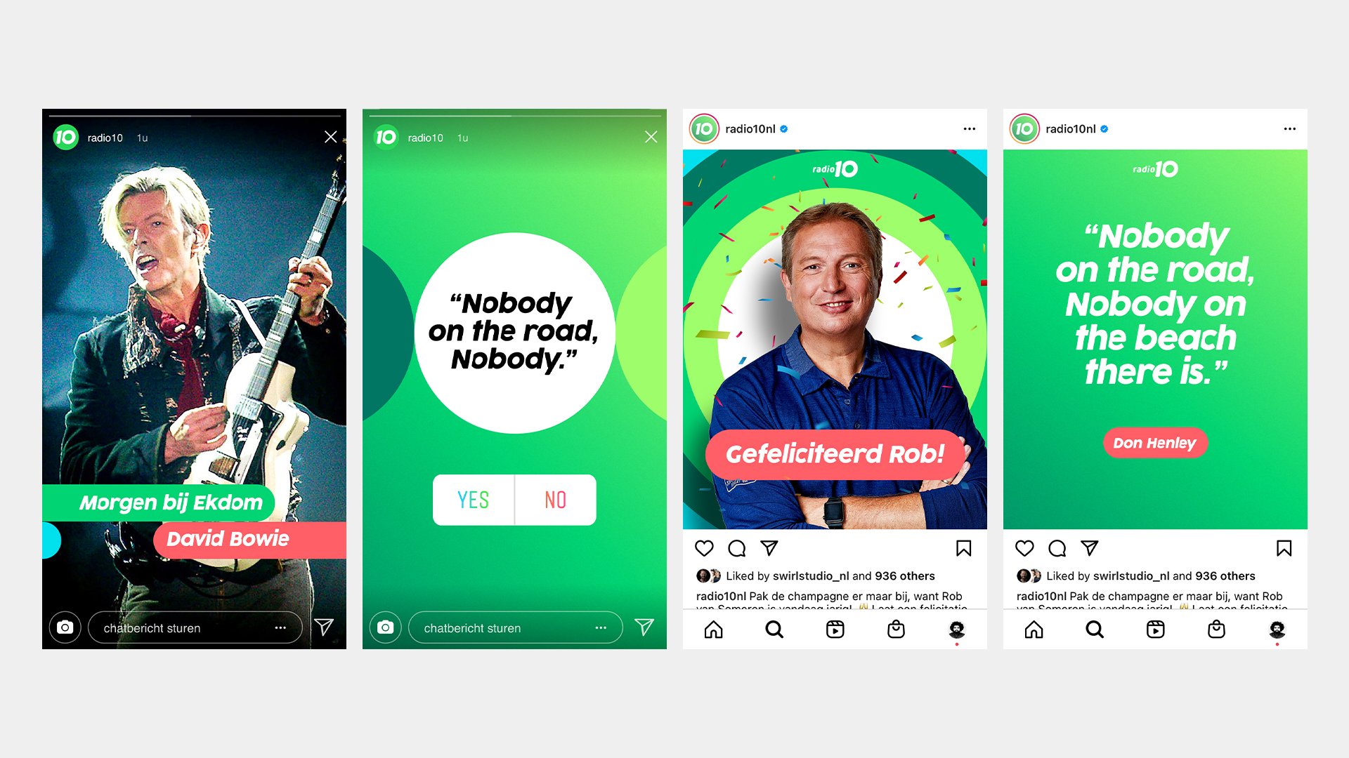
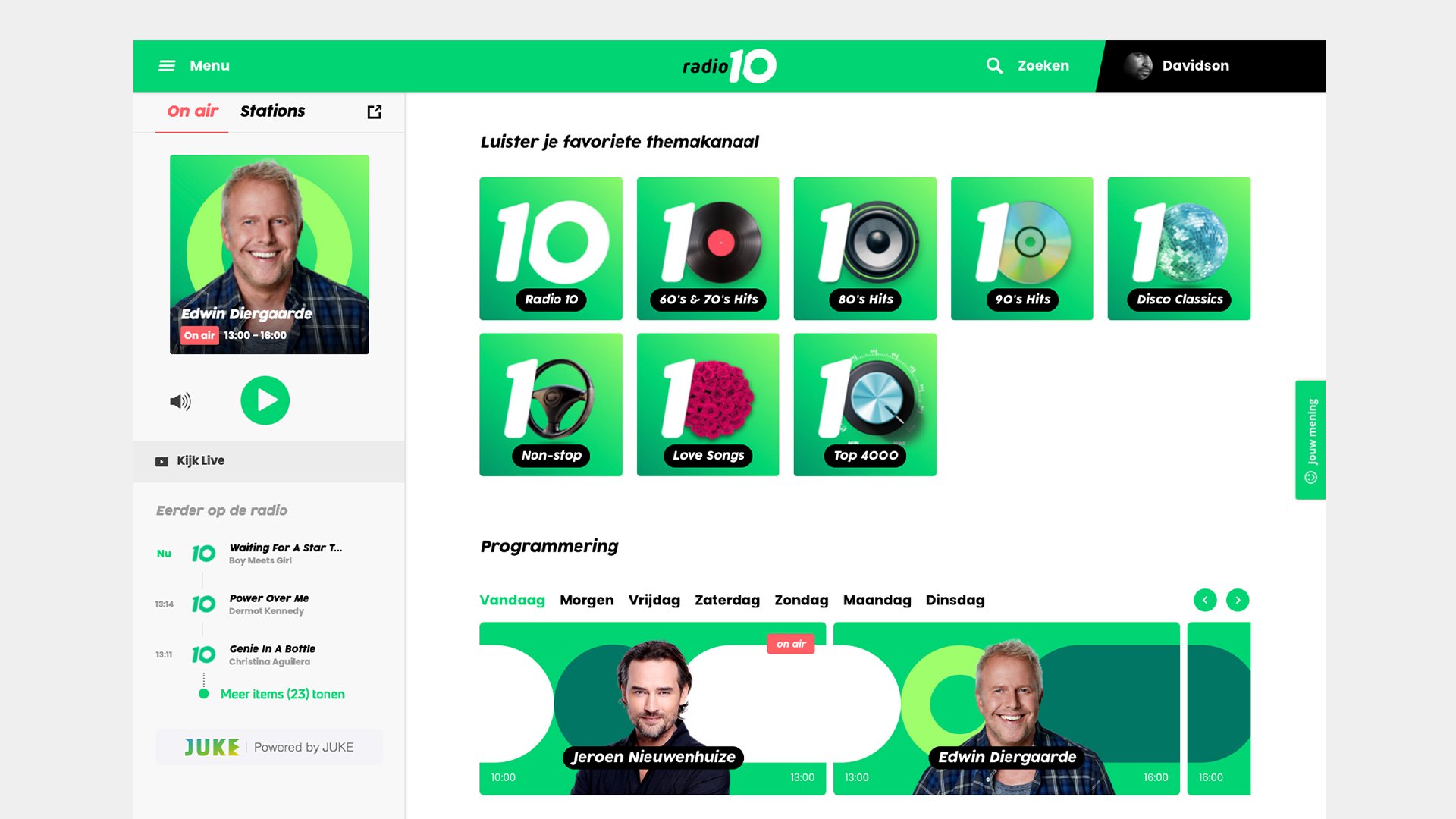
The (0) is the base of the identity, this represents speakers, vinyl records, CD, but also the every day elements as flowers, cup of coffee, etc. We translated this thought al touch points of the Radio 10 brand.






-
Client — Radio 10
Agency — het Bureau van Talpa Network
Brand Director Radio — Caroline Will
Programmadirecteur Radio 10 — Roland Snoeijer
Brand manager & Strategy lead — Rein Hendriks & Danny Zeeuw
Concept brand campagne — Stefan da Costa Gomez, Auke Van Rossum
Strategy director — Rose Zandvliet
Executive producer — Jenny Bakker
Creative producer — Fabian Muller, Wibout Warnaar
Art Directors — Sander Rietdijk, Stefan da Costa Gomez
Lead Designer — Davidson Lopes
Designer — Tessa van den Brink
Regie — Daan Groot
Productie — Holy Fools, Collin Maas, Tom Raeymaekers, Annemieke Boschma
DoP — Michel Rosendaal
Edit — Johannes de Jong, Ton Habraken
Audio — Philip Klees
Animatie — Menno Wisselink
Fotografie — Jaap Vliegenthart, Remko Modderkolk